Showing posts with label horses. Show all posts

Monday, May 11, 2009

Horse Painting in Photoshop

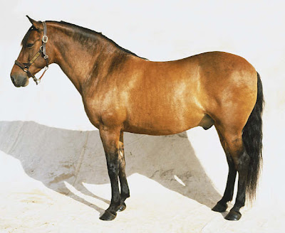
As promised, here's the step-by-step Reeser guide to horse painting in Adobe Photoshop! Before you start, it's important to have reference for lighting on a horse (pick one close to the color of horse you'd like to paint.) I chose this bay mustang because it had great lighting on the skin. You are using this image as a guide for how light hits the form of the horse's muscles, so choose a picture that is easy to "read."
Next, see to your brushes. I am using Photoshop for this painting, but would like it to have the nice "real media" quality you can acheive in Corel Painter. I created a set of 3 brushes to emulate hairy-oily brushes, with one of the brushes only having a few "hairs" in it. I will use the thickest brush for the majority of the painting, and the thinner hair brushes to add texture and particularly to paint in the mane and tail. Too see a tutorial on how to make custom "oily" brushes, click HERE.
Now about the horse. You've already got the sketch, so now it's time to paint. I layed out a color palette directly on the canvas, so I could sample from it. There are light yellows, golds, reddish browns of multiple values, greyish blues in couple values, and a collection of blacks and very dark greys.
Using the gold color and you thickest oily brush, block in the color all over the horse. Don't be careful about this, just slap it on. You're laying down a warm undertone that will help establish depth and a richness of color.

Next, continue with the warm color, using the golden brown, and blocking in basic "darks" according to your picture. Don't worry about getting these areas to their full darkness yet. You're just establishing basic lighting and placement of shadow and form.
Continue establishing your darks with a rich brown, but still leave some of the original yellow and reddish brown showing through. If you need help seeing the darkest shapes on your reference photo, squint at it or blur your eyes. At this point, don't worry about rendering, just the blocky shapes of the shadows and lights. You might be thinking this looks like a mess now, but forge ahead!
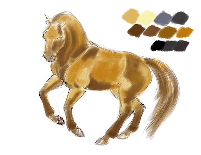
Now it's time to start working with your blues. Using blues, instead of black, for your darker shadowed areas lends your subject a life and interest. Blue and orange are compliments, and form a lovely balance and richness for the eye when paired, even in their subtlest forms. Start blending the darkest grey-blue into the shadowed areas.
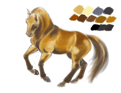

You may need to adjust the overall color of the horse to match your reference coloration. Mine was not looking red enough, so I added in some richer red-browns, all the while keeping my light golden starting color showing through, and continuing to darken and blend the shadowed areas with blue-grey and darker greys.
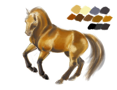
With the lay-in of colors complete, begin rendering by smoothing and blending. Continue to build up colors, and don't worry about brushstrokes, sketch lines, and base colors coming through in some places. Keep the edges of the shadows and lights fuzzy - hard lines will make the horse look plastic or flayed.
You will notice that even though the legs of the horse are black, I have still made sure to delineate the planes of the legs by highlighting with the lighter grey-blue and some warmer tones. Even if you can't see the light on the legs in your reference photo, it is important that you include it in your painting, so the legs don't go flat.
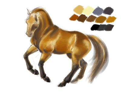
You may decide at some point that your body color is too hot or saturate. I desaturated my reds by using the "Hue/Saturation" tool and reducing the reds only.
My darks, particularly on the legs, needed some adjustments, as well as some of the darkest areas under the jaw/cheek of the horse, the belly, and the chest. I worked in some black-black, but in very small amounts.

Once I was happy with the painting on the body of the horse, I blocked in the mane, then switched brushes, to the middle-thickness oily-hair brush, and continued to work with the mane and tail.
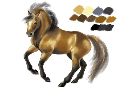
Just like the body, I incorporated blues and warmer tones into the mane, and used some straight strokes and some slightly wavy, moving generally in the same direction, but not as one clump. For the finishing touches, I switched brushes again to the thinnest hair brush, with only a few hairs, and swept in some more strokes on the mane and tail, to make it look natural.
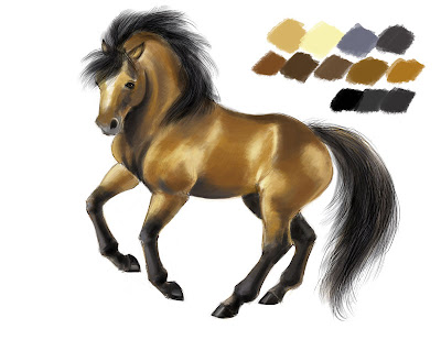
For finishing, I used a regular round brush, with opacity and flow on pressure-sensitive, and cleaned up the edges all around the horse, erasing some of the rough linework and stray paint. I liked the look of the sketch showing through the painting in some places, so I left a bit of it. I also rendered the hooves roughly, with clean edges, and painted in the eye.
For a large image, to see the brushstrokes and the rendering, click the finished painting below:
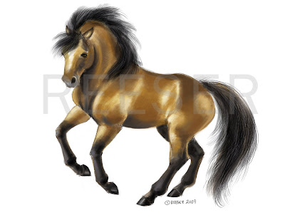
I hope you enjoyed this step-by-step! Please notes and comments in the comments section, or post links to your horse painting!

Wednesday, April 01, 2009

Stubbs-ey


Yesterday I had a fabulous time painting horses at work, the finished pieces for which I will someday be able to post up here (in a humungoid art dump sure to come sometime after June/July). I do not have Corel Painter on my work computer, so I spent a little time developing a set of Photoshop brushes to mimic the hairy-oily effects I love so much in Painter, and those effects that have come to be essential to me when painting horses.

I'm not a very experienced horse painter. I've maybe drawn 100,000 sketches and doodles of horses, throughout my 25 years, but I've only recently begun to render them both tonally and in full color. I think now that it's not so much the anatomy of the horse that my professors tried so hard to make us all fear, but instead the play of light on the musculature, all tucked neatly under a thin, tight, glossy skin. Simple shapes suddenly become not-so-simple when you look at a photo or a painting of a horse's flank. Even the lighting on their barrel-shaped tummies is not how I would expect essentially a cylinder to be rendered. It's perplexing!

Enter George Stubbs, the quinticential painter of horses, in his time (the 18th c.) as well as today. Stubbs is maybe known better in the artist mainstream as the fellow who did those intricate anatomical plates found in quite a few animal anatomy books. However, he was also a very successful painter who was commissioned to paint the studs, Thoroughbreds, Arabs, and other shockingly expensive and high-bred horses of the English nobility. There are many of Stubbs' paintings that do not appeal - skinny, posed, wild-eyed equines, or horses that look cartoonish and fat. We must not forget the aesthetics of the time. When it comes to that lighting and the anatomy, however, the paintings are simply incredible. They are both strong and subtle, with perfect light and color. The horses may not look like *real* horses (as in a photograph), but they all seem full of personality, uniqueness, and as if you could walk up and have a conversation.

Anyway, I spent a lot of time with "Whistlejacket" (coolest horse name ever, btw) and "Mambrino" yesterday, and feel I've come a long way in the rendering of the horse for having studied those two paintings so closely. I still do not, however, have a firm grasp on WHY the light performs the way it does, so for my warm-up sketches today, I took a look at some basic musculature in the flank, and tried to deconstruct how exactly things connected, moved, and would be lighted. I've a long way to go!!
And in the spirit of coolness, I used my favorite "old paper" background. Enjoy!

Sunday, February 01, 2009

Black Beauty


I often paint Black Beauty - he's just a horse that keeps coming back to either inspire or haunt me. I felt compelled to push around some paint-pixels in Corel this weekend and made something narrative out of it instead of just a sketch. It's dismal, but so was the book! However, I'm liking the implication of horse rather than the anatomical study...

Friday, January 23, 2009

Buckskin Horse


Morning warm-up. This is kindof mooshy...played with it way too long.

Wednesday, January 21, 2009

Yellow Horse


Fat. Little Wings. YELLOW. Woot.


Morning work sketch.

Tuesday, January 20, 2009

Belgian Scribble


Wow, I haven't worked in Painter in awhile now, and I MISS it! I scribbled out this Belgian horse tonight...felt compelled to paint something loose and oily, after a day of precise rendering. I probably should've left this drawing even chunkier.

As a horse-dork side note, I find it interested that the European version of the Belgian draught horse has this dark reddish brown coloring, with black points, while we recognize Belgians as blonde here in America. My conformation in the drawing isn't very Belgian-like...much more Percheron, but oh well...my heavy horses are always a little too tall, I think. I'll have to make a point to make the next one short and stout.

GreenHorse


Hooray, the first "real" post of 2009! I'm going to start doing warm-up sketches at work, especially on Mondays, after the weekend. I use a Wacom Cintiq at work, which takes about 3 seconds to get used to again, but I would rather get back in the flow of things with a little sketchy-sketch, than spend time stumbling through my first drawings of the week.


Anyway, here's a green horse for you!

Friday, December 05, 2008

Bernie


A Christmas gift portrait of "Bernie," the former stallion. Blocked in in Photoshop using the lovely canvas texture brush, then worked in Corel Painter, leaving some of the canvas to show through, and working with a very "hairy" brush.

Saturday, November 15, 2008

Winter Percheron


Another "Winter Horse" painting complete. I didn't like the green for the halter -- the painting needed more warm contrast, and something about this wintry blue and bold red together makes me think of Christmas :-).
I used the incredible watercolor crystal brush for the dapple grey spots. I can't imagine anything working better! This brush was created by Erin Middendorf, but I have no idea where the download is posted for it (go ask her, it's worth it!). I think you could also create your own with a little work.
What's next in the Winter Horse series? Maybe a Fjord, or a Belgian -- I'm missing that most recognized draught horse, as well as a Shire, so perhaps I'll do those two next.

This and all the other Winter Horse cards are available at GreetingCardUniverse.com

Friday, November 14, 2008

Winter Percheron - In Progress


So, a series! I think I like this one the best of the three so far. I love dapple gray percherons, their conformation and power. This piece doesn't have the action I thought I originally wanted in all of these, but I like the variety. I wanted this to be a strong "in your face" kind of pose. The feet will not be visible in the final, and you can see I still have work to do on the front legs and head. Then onto the dapples! The best part! I'm looking forward to using the watercolor crystal brush for that, though I doubt it'll solve everything, so I'll probably need to get in there and work out the dapples by hand too.

Thursday, November 13, 2008

Winter Clydesdale


Finished this one at the library tonight -- I don't get internet there, so I really have no choice but to paint. It's really a wonderful alternative to sitting at home with all the temptations of doing something besides what I'm supposed to be doing. I'm showing a detail of the painting too, since I'm in love with Corel Painter and love looking at these brushstrokes.

The next in the series is a percheron, dapple gray, which I think will be a cool painting with this snowy foggy effect. Plus I'm itching to use these watercolor salt brushes a little more. Should be fun.

Wednesday, November 05, 2008

Friesian Holiday Goodness


Who doesn't love Friesian horses running through the snow?

I'm putting this image up for sale, like, everywhere...

Greeting Cards at GreetingCardUniverse.com

Posters, mugs, t-shirts, other stuff at Cafepress.com

Monday, November 03, 2008

Friesian - In Progress


This is an underpainting for a "holiday friesian." He'll be charging through the snow, and be decorated with a red halter and maybe some jingle bells and holly in his mane...things like that. It won't scream "CHRISTMAS!" but it will be wintry and pretty :-).

Cross-posted from Sketch of the Horse.

Monday, October 13, 2008

Horses and Stock


I've set up a new blog recently called "Sketch of the Horse," where I will be putting all my horsey sketches and paintings. Never fear, though, for I will put them here as well! This is an in-progress horsey paint sketch, to work more with Corel Painter, and have some stuff to put on the new SotH blog (I'm on a webring now; I have more of an obligation!).
Also, some stock illustration. I've been doing bunches of totally random stuff. Whatever pops into my mind. In taking a look at the "most downloaded" examples, though, I see a lot of this heraldry/design elements kind of stuff. It's useful, for sure! So I jumped on the "wings&banners&swirls OH MY!" bandwagon and made some of my own. Kindof fun :-). The one with the deer is a vintagey label thing...see? completely random. But hey, if two people have downloaded my page of horsey silhouettes, and I have made $0.60, then maybe they will like my other things as well :-). If for some reason you want to buy my vector stock illustrations, they're on Vectorstock.com.

Monday, October 06, 2008

Knights of A - Beltain, Work-in-Prog


Ok, well...my control and speed in Corel Painter isn't all that great at this point, and though I love love love the oil painting effects I'm getting, I found myself already over-rendering things. I like the rough, broken color effects, but for this particular application I need a more detailed approach. So...I imported back into Photoshop and got the painting "back on track." I'm thinking I take it back into Painter again and touch up the horse with the lovely oily brush, since it works so nicely for that shiny equine coat I'm always going for. Anyway, here's an in-progress. I changed the background a lot, as you can see, and am trying to add more drama, less weird purple light. :-)

Knights of A - The Headless Horseman

So here is the final for the Blue Knight on "Duke" the belgian draft. Beautious! Up next is "Beltain," from a lovely photo taken by Katrina Markham, the Knights of A's photographer. Thanks to JP Balmet, I've caught the "real media brush" bug, or the strong desire to make my digital painting look, well, not digital. JP does amazing things with brushes in Photoshop, and he gave me a few tips, but I still can't seem to match the incredible brushes in Corel Painter. Originally with this new painting I meant to just get the backround in using some nice oily flat brushes in Painter, and then come back into Photoshop to do the subject, but after messing around in Painter for long enough I began to get the hang of how the brushes work. It's a whole different philosophy than Photoshop, and takes quite a lot of getting used to (my first attempt to work in Painter, 6 months ago or so, failed miserably and I got frustrated), but I am just awed by how realistic and beautiful the "paint" looks and feels. At some point I might take this image back into Photoshop, but I'm going to take it as far as I can in Painter first. Yes, it'll be a different "style" and "media" than the previous two Knights of Avalon paintings, but variety is the spice of life :-). Both methods are painterly, which is the whole point...this one is just moreso.

Thursday, October 02, 2008

Knights of Avalon - Blue Belgian pt. 2


This piece has about 2 hours of rendering left. Everything is done except for the top half of our friend the knight, and some tweaks to the background and whatever else catches my eye. I'm really needing to work with some different brushes, as much as a love this rough canvas effect. Perhaps I will spend the rest of the day building brushes :-).

Thursday, September 18, 2008

Knights of Avalon - Blue Knight WIP


Knights of A painting #2. I like the composition of this one a bit better, and the nice color contrast between the blonde of the Belgian and the dark green background.

Knights of Avalon


Here's the finish on the Knights of Avalon painting. It's kindof a weird little painting...a-symmetrical, with the horse coming into the frame, without showing the back leg. The palette is very neutral and blue-gray. It will look lovely as a postcard, I think!

Monday, September 15, 2008

Knights of Avalon - WIP


I'm doing up some paintings for The Knights of Avalon, our most beloved jousting troupe. Here's a work-in-prog. You can see the parts I've rendered and what I haven't gotten to yet. This one has about a day's work left in it before I call it finished. I like the broken color and loose feeling of this style of painting, and I don't want to overdo it. I will probably just finish out Bil's face, touch up a few more edges and forms, and call it done. Then on to the next one!