
 Next, see to your brushes. I am using Photoshop for this painting, but would like it to have the nice "real media" quality you can acheive in Corel Painter. I created a set of 3 brushes to emulate hairy-oily brushes, with one of the brushes only having a few "hairs" in it. I will use the thickest brush for the majority of the painting, and the thinner hair brushes to add texture and particularly to paint in the mane and tail. Too see a tutorial on how to make custom "oily" brushes, click HERE.
Now about the horse. You've already got the sketch, so now it's time to paint. I layed out a color palette directly on the canvas, so I could sample from it. There are light yellows, golds, reddish browns of multiple values, greyish blues in couple values, and a collection of blacks and very dark greys.
Using the gold color and you thickest oily brush, block in the color all over the horse. Don't be careful about this, just slap it on. You're laying down a warm undertone that will help establish depth and a richness of color.

Next, continue with the warm color, using the golden brown, and blocking in basic "darks" according to your picture. Don't worry about getting these areas to their full darkness yet. You're just establishing basic lighting and placement of shadow and form.
 Continue establishing your darks with a rich brown, but still leave some of the original yellow and reddish brown showing through. If you need help seeing the darkest shapes on your reference photo, squint at it or blur your eyes. At this point, don't worry about rendering, just the blocky shapes of the shadows and lights. You might be thinking this looks like a mess now, but forge ahead!
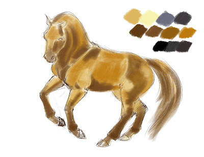 Now it's time to start working with your blues. Using blues, instead of black, for your darker shadowed areas lends your subject a life and interest. Blue and orange are compliments, and form a lovely balance and richness for the eye when paired, even in their subtlest forms. Start blending the darkest grey-blue into the shadowed areas.
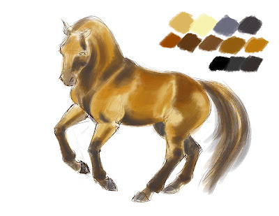
You may need to adjust the overall color of the horse to match your reference coloration. Mine was not looking red enough, so I added in some richer red-browns, all the while keeping my light golden starting color showing through, and continuing to darken and blend the shadowed areas with blue-grey and darker greys.
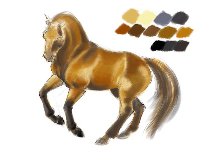 With the lay-in of colors complete, begin rendering by smoothing and blending. Continue to build up colors, and don't worry about brushstrokes, sketch lines, and base colors coming through in some places. Keep the edges of the shadows and lights fuzzy - hard lines will make the horse look plastic or flayed.
 You will notice that even though the legs of the horse are black, I have still made sure to delineate the planes of the legs by highlighting with the lighter grey-blue and some warmer tones. Even if you can't see the light on the legs in your reference photo, it is important that you include it in your painting, so the legs don't go flat.
 You may decide at some point that your body color is too hot or saturate. I desaturated my reds by using the "Hue/Saturation" tool and reducing the reds only.
 My darks, particularly on the legs, needed some adjustments, as well as some of the darkest areas under the jaw/cheek of the horse, the belly, and the chest. I worked in some black-black, but in very small amounts.
Once I was happy with the painting on the body of the horse, I blocked in the mane, then switched brushes, to the middle-thickness oily-hair brush, and continued to work with the mane and tail.
Once I was happy with the painting on the body of the horse, I blocked in the mane, then switched brushes, to the middle-thickness oily-hair brush, and continued to work with the mane and tail.
Just like the body, I incorporated blues and warmer tones into the mane, and used some straight strokes and some slightly wavy, moving generally in the same direction, but not as one clump. For the finishing touches, I switched brushes again to the thinnest hair brush, with only a few hairs, and swept in some more strokes on the mane and tail, to make it look natural.
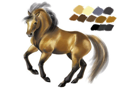
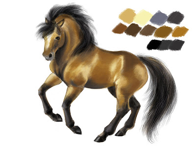 For finishing, I used a regular round brush, with opacity and flow on pressure-sensitive, and cleaned up the edges all around the horse, erasing some of the rough linework and stray paint. I liked the look of the sketch showing through the painting in some places, so I left a bit of it. I also rendered the hooves roughly, with clean edges, and painted in the eye.
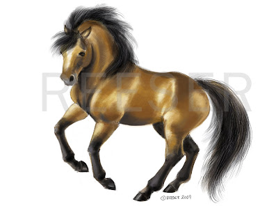
 For a large image, to see the brushstrokes and the rendering, click the finished painting below:
 I hope you enjoyed this step-by-step! Please notes and comments in the comments section, or post links to your horse painting!