Thursday, September 28, 2006

Another "Flight" Panel


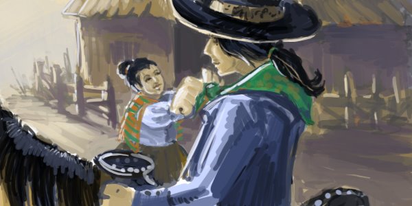
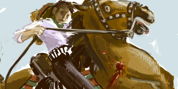
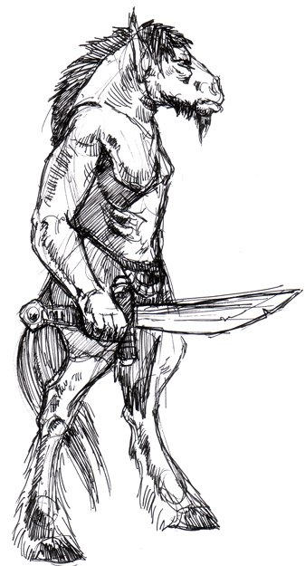
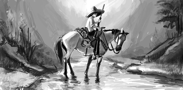
I was assigned to illustrate two of the five panels for our group pitch for "Flight." I am using the appropriately titled "Shot Horse" (see below) for one, and this new one posted here. I did not do this panel in color--aw! :-(-- because we decided to stick to black and white, as a group, in order to tie all our pieces together. I didn't mind doing it in black and white--it'll be a good base to work over in color later. I have to say I am loving this project (does it show?).

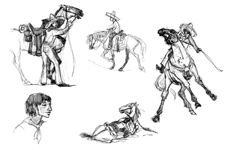
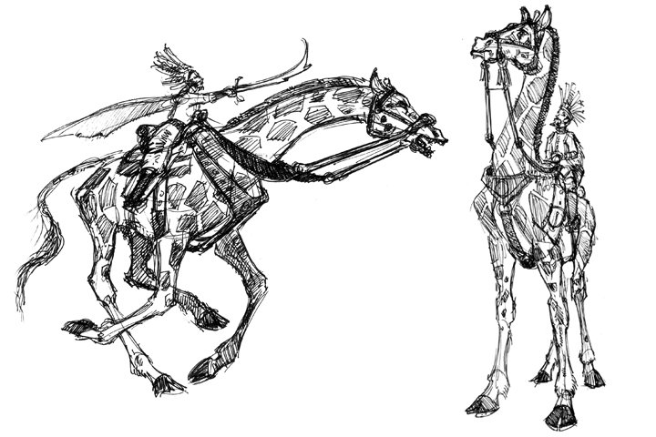
I'm also posting some ideations--you can see the original sketch for this painting, ans some thumbnails that correspond to the color sketches in previous entries. I always like seeing the process of things, so I thought I'd include it for you :-). --L

Wednesday, September 27, 2006

More "Flight" Color Keys


Here are some more little color keys I've done for "Flight." I'm admittedly having a tough time with them...the color, that is. As usual when I paint in Photoshop, what is in my head is not what appears on screen. I think there's something to it much like jazz improv...you just have to feel it, and let it do what it's going to do--there are no bad notes, just notes that lead to other notes. Hrm. Anyway, I'm kindof happy with some of these keys (I'm not putting up the ones I'm not happy with!). Erin has some great color sketches up, and they've helped me a bit. Oh, and the quality of these is so poor when uploaded, so do realize they're not so blurry! My apologies for that. So...more sketches para tu :-) --L

Tuesday, September 26, 2006

"Flight" Preliminary Sketches


Hey all. As "Heart of Darkness" wrapped last week, our new project for BFA is a Steinbeck story called "Flight." Erin and I already headed down the coast to Monterey, where the story takes place, and wandered around Hwy 1, between Carmel and Big Sur, and got a great feel for the setting. These two "thumbnails" are more based on what I saw in my head as I was reading the story, than what I saw down Hwy 1. I wanted to get the color and mood down before I further inform my drawings with the reference we gathered on Saturday. So here are couple RAW sketches, for "Flight."

Thursday, September 21, 2006

Heart of Darkness Wrap


Here is my final piece for "Heart of Darkness." I went a little nuts, and frankly I like--no, LOVE--the result. I took what I learned from the Sheeler assignment and either adapted it to me, or I adapted to it. I had a good time with this piece...I was out drawing "jungle plants" and then scanning them in and cutting out all the negative shapes. I did the same for the skulls. I think it has been a fine exercise in sillhouette, if nothing else. But I also just like the piece...it's crazy, and that's exactly what I was going for. I've never worked in this style before...never done anything at all like it, in fact, and I feel both nervous about turning it in, and also proud that I was able to venture down a completely different avenue, and like it so much. Do enjoy! :-) --L

Thursday, September 14, 2006

I'll Try The Sheeler, Please...


Here's one of the three drawings I did while trying to "think" like Charles Sheeler. Initially, I did not like this artist, but the more I studied him, the more appreciation I developed. I won't go into a big long thing about him, but here's a drawing a la Sheeler. This is how I thought he would approach the steamboat for "Heart of Darkness:" by drawing not the boat, but the engine. We'll see how it flies in BFA :-).

Monday, September 11, 2006

Mark-Making.


Here's a Photoshop painting I did to try'n get myself to loosen up with the marks. I experimented a lot with various brushes and filters and whatnot. I don't claim that this is a good painting, but I'm putting it up here because it's, again, some kind of improvement over what I have been doing. Generally, it took way too long, but I think that's because I was intent on rendering out the face and hands smoothly...I wanted more contrast there, as if those elements were floating (think 14th century gilded painting), but I did a red and black background, instead of something that would blend with the dress. My originally Klimt-ey idea, then, sortof evolved, but I'm not unhappy with the result . --L

Thursday, September 07, 2006

Environment Sketches, Heart of Darkness

Hey folks. Well here's my week's worth of gruelling Photoshop work. What a huge learning curve! Craig Mullins makes it look so easy, but it's NOT. I like the two in sepia tone the most...I was much more confident doing those, and I like how they turned out. I know I'm thinking inside the Photoshop box, and I'm slow to experiment. I think perhaps having to do it for assignments is a little nerve-racking too...since I have a spot of spare time (oh my!) tonight, I think I'll do some explorations and studies. For now, here's my work for the layout assignment...--L

Tuesday, September 05, 2006

Doodles of Darkness...


The next assignment in BFA is (for me) to do 3 layouts or environments for "Heart of Darkness." I did some thumbnails (not enough yet) and decided to try out some techniques in Photoshop, to decide if that's the avenue I want to take for this project. I chose this fairly simple layout and just jumped right in with the color. I'm pleased to say that I think I'm figuring out this rough-stroke-detail thing that I find so appealing. I need more practice, but this little piece is a departure from my earlier photoshop work, so as long as I keep departing, I'm happy.

And just for fun, giraffe warriors!

Friday, September 01, 2006

Grrr! HorseyMan!


...had some fun drawing this guy today...the first of my creature explorations I'd like to start on for Blizzard and Weta.