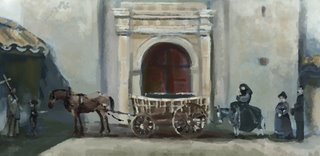
 So I finally finished "Cold Morning" (I have terrible names, I know...they're just my descriptive filenames that then somehow turn into titles), which you see below. I swiped some color on those empty areas and threw a filter on it. I know that's kindof taboo, but all those lines were really just mucking the thing up, and overall I did not dislike the piece, it just needed to be simplified. So simplify I did, at the click of a button :-)
 The other is my favorite piece from the whole project. I have terrible eye-level-horizon-line syndrome, so I wanted to try'n break out of that by doing a composition with the figures way way way at the top (even one of them cut off)...this would be even more dramatic if it were in a vertical format, but I wanted to stick to the widescreen constraints of the projects, even though I can kindof do whatever I want as a visdev artist. I like it just fine how it is, though, and I think the color came out very nice (quality is so bad on the internet! it's so much cooler than this, for real!). I looked a lot at Craig Mullin's "Sedone--Irish Knight" painting for the color and atmosphere. It was a big help in this project, as Craig is a big inspiration in everything I do :-). So without further adieu.... --L
